Managing a Collection of Steel Pens: Part 1, Recording Information

Ok, so you’ve read some of my ramblings and are interested in steel pens. You start to pick up a few from eBay, flea markets, estate sales, etc… Now what? If you’re anything like me, you will soon start to have bags and boxes of pens which need ordering so you can both know what you have as well as find those you want. You also want to store them in such a way as to keep them from rusting (or rusting further).

Congratulations, you now have a collection! Whether your collection is a few dozen or thousands, it will help you in the long run to have some kind of consistent way to record the pens, store the pens, and both should help you find the pens.

I’m going to write a short set of articles on these three main issues beginning with your records.

Keeping Records

You look at a pile of pens, especially vintage pens, and there are any number of ways of dividing them into individual types. There is also a lot of different information you can gather on each type. What you’re figuring out is what makes for an individual “record” and what information you want to collect for each record.

Let’s say you have a large pile of fruit. You can sort them by round fruit vs. long fruit, big vs. small (with a range for each), by color, etc… You could also divide by name and then record a lot of this information in each record so you can go back and make further divisions. So, you could record each fruit by it’s common name. You have a record for Granny Smith Apples, another for Red Delicious Apples, another for Valencia Oranges, and one for Unknown Pineapple. In each record you can record the shape, the color, the weight, whatever makes sense. Then later, with the right tools, you can go back and extract all of the records of red, round fruit, or all fruit over 20 grams and yellow.

What you put into each record depends on the type of information you are interested in. You can always start with a set of fields (discreet pieces of information like “size,” “shape,” etc…), and at some point if you wish to add more fields, you’ll have to go back to each physical object and record the new data point.

My records started out fairly basic but have grown over time. The first thing to think about is what will cause one pen to have one record, and another pen a separate one.  Name and number are the most obvious means to differentiate one pen from another. An Esterbrook 314 is obviously going to have a different record than an Esterbrook 556 or an Eagle E410. But there can be several other ways of differentiating pens.

Differentiators

Early on, reading the great sites like Brandon McKinney’s, I was able to find out that the imprints on pens can indicate a difference for when the pens were made, so I decided early on, that a difference in imprint (the words imprinted on a pen) would be a differentiator that would indicate a different type. I also decided that finish (gray, silver, gilt, black, etc…) would also be a differentiator.  Basically, I was looking for ways to further split pens into smaller groups (“types”) than just name and number.

You can also run into cases where the same kind of pen retains the same number, but the name changes. Esterbrook was particularly guilty of this re-naming as markets changed. The Esterbrook 556 is a rather extreme example. The imprints on the 556 include:

  • Just “556”
  • “556 Pen”
  • “556 Advanced School”
  • “556 School Medium Firm”
  • “556 Vertical Writer”

For my collection, these are all different types. And if I found a “556 Pen” in gold plated, in addition to the normal “gray” then that would be a different type altogether.

Standardization

In the database world, what you want whenever possible is to “noramlize” the data, which means to make sure the same meaning always uses the same words. To take an example, let’s say I’m gather information about the color of the pens. For those who are have a (VERY) thin layer of gold on them, I could use the terms “gold,” “gilt,” and “golden” without any rhyme or reason. Some days I might use “gilt” and others something else. If you did this, what you would have are records which cannot all be found by searching on a single word. You would have to know all of the possible search words to find all of the records which match.

This is where “standardization of terms” becomes something very useful and not just for data nerds.

There are several fields (pieces of information I record for each record) I have attempted to standardize: Finish, Shape, and Tip. The problem I ran into is that there aren’t industry standard terms used consistently by all manufacturers to describe these characteristics of pens. Instead you get a lot of terms that all mean roughly the same thing. So, I decided to make my own list of standardized terms which, so far, have been “good enough.” to save you all of the trouble I went to, I’ll share with you what terms I’ve settled on. We’ll start with the easy ones first: finish and tip.

Finish

Pen colors
Found this picture on the internet of the range of colors pens can have. It’s not complete, but pretty close and gives a good idea of the range you can find. If anyone has an idea of the source, please let me know so I can give credit.

The final step in a pen’s actual manufacture, before sorting and boxing, was to pop it back into ovens to get a certain color on the pen. This accounts for most of the colors pens come in, especially the two most common, gray and bronze. You can achieve a fairly high range of colors just from re-heating.

Pen Colors Tempering_standards_used_in_blacksmithing
The colors possible just from heating steel.  Another image I’ve found in various places. Again, if anyone knows the source, let me know.

This re-heating is not hot enough to adversely affect the desired temper, but it does change the color. This step was also one of the most delicate and difficult steps which required someone very experienced who could get the pens to the right color without damaging them or their temper.

The other way to change the color of a pen is by a coating. Because steel rusts when in contact with water, manufacturers put all kinds of coatings on pens to supposedly slow down the inevitable rusting. These coatings could also be a status symbol, especially ones with a gold coating. Solid gold pens were orders of magnitude more expensive than a steel pen. (you might pay $12 for a normal gold pen when steel pens were $0.75 per gross) Some people wanted to be seen writing with a gold pen without paying for an actual gold pen, or liked the performance of a steel pen better but wanted the rust resistance of a gold coating.

Other common coating included silver alloys, nickel alloys and a black, tar-like substance. Copper coating is also mentioned but is extremely rare. Nickel-coated pens were also sometimes said to have a “white” finish. Nickel can sometimes be difficult to tell apart from very shiny steel. It’s usually not so shiny as a silver alloy, but shinier than bare steel.

And the last way to “color” a pen is the material. My collection is one of steel pens, but, along with steel, there were some pens made and sold like steel pens but were made of an alloy of brass. These pens are gold-colored, but aren’t gold plated (though there are examples of brass pens with gold plating). They are made of a copper-zinc alloy and have their antecedents in the “Pinchbeck” pens of the 18th-19th-centuries.

So, here are my standardized finishes with a little explanation of each

  1. Black: an easy-to-spot finish. Also called “Tar” finish
  2. Blue: also pretty self-explanatory. You rarely see this finish in the US except Esterbrook’s tiny artists pens. It’s more common in Europe.
  3. Bronze: one of the most common colors along with gray. Bronze can come in various shades from dark to light. This can be on purpose, but since I’ve found sealed boxes of bronze finishes that vary in lightness, I assume it can also be just how long the pen was left in the oven.
  4. Copper: Copper coating is extremely rare, and died out fairly quickly in the US. I have one copper-coated pen, an Esterbrook 048, but others were advertised as available in a copper finish. I assume this was also to prevent rust, though copper does corrode.
  5. Fawn: Another color advertised. I would assume, from seeing pictures of salesman sample books with pens identified as this finish, that it’s another word for a very light-colored bronze. This one is very difficult to differentiate in the wild without a positive identification. I’m sure some I’ve marked as “Bronze” were considered “Fawn” when sold, but it’s very hard to tell.
  6. Gold: This is the term I use for gold-plated or gilt. I record my actual gold pens in another data store, and they have different fields.
  7. Golden: This is the term often used to indicate the brass pens. I use this term for brass pens without an additional finish (like “Gold”).
  8. Gray: The most common finish for American pens, especially those made in the 20th-century. It’s the plain color of steel.
  9. Half-Gold: Esterbrook made one pen they call “half-gold” and I have adopted the term to also apply to pens like the Spencerian 42 Gilt-point where the body of the nib is gilt, but the heel is still plain steel.
  10. Nickel/White: There are three terms which can easily get mistaken for each other in the wild: Nickel, White, and Silver. A nickel coating is more silvery than a gray pen, but not as shiny as a silver-coated pen. I tend not to use this unless I’m pretty sure it’s actually nickel coated, like it’s silvery, but the pen never came in silver-coating but was advertised in nickel or white.
  11. Purple: Some purple can be difficult to differentiate from very dark Bronze in the wild. But this was an advertised finish so I’ve added it to my list in case I ever am lucky enough to find one labeled as such.
  12. Silver: Silver coatings were quite popular, with the Esterbrook Radio finish being the most common, along with the Hunt X-series.

Shapes

I dealt with Shapes in my proposed Glossary of Shapes.

To the shapes I’ve discussed there, I’ve added three more

  1. Small Inflexible: While I try and stay away from capturing sizes of a particular shape (down that road lies calipers and madness), the Inflexible seems to have really only two sizes, big and little. The “big” is really just a normal-sized pen. The Small Inflexible is really smaller, as in a Lady Falcon vs. a normal Falcon.
  2. Pinched Leaf: While a Pinched Spoon is a spoon shape with a break between the heel and the body of the spoon, a Pinched Leaf is similar but for a leaf-shaped pen.
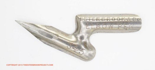
  3. Offset: This is an odd one. It is very, very slightly oblique, but not enough to be a truly oblique pen, and the body shape, while reminiscent of an elbow oblique, is unique.  The patent on the pen says: Pat 7-1-90 & 3-22-93.

OLYMPUS DIGITAL CAMERA

Tips

The tip of a pen can greatly impact how a pen writes, and the kind of line(s) it produces. The tips of pens actually fall into fairly clear categories. Beware, though, you have to observe the actual nib and cannot rely on advertising because different manufacturers called the same kind of tipe many different things. This is particularly true of the first kind.

  1. Ball: When you look at this tip under magnification, it looks like someone took a very small round-tipped punch and deformed the tip of the pen into a small hollow as seen from above, or into a small round or oval convexity if seen from below. This is a very common type of tip and was called many, many things, Oval Point, Ball Point, Round Point, etc… They all look basically the same. Some may be a little more oval than others, but they’re all basically the same. Some Ball tips can be pretty shallow and the only way to tell if it is a Ball or a Turned-Up tip is to look under magnification. The way to tell a Turned-up tip from a Ball tip is that the turned up tip does not extend below the bottom surface of the tines. A Ball tip has the steel of the tip deformed so that it extends below the bottom surface. Est 902 Oval Tip top2
  2. DoublePoint: These nibs have more than one point. They can also be called names like Double Ruling Pen.
  3. Folded: Uncommon on dip pens, but much more common on cheap fountain pen nibs, the folded tip is where the very tip was drawn out longer than normal, then folded under to create an approximation of a Tipped nib. I’ve only seen these on very late dip pens which are trying to imitate the cheap fountain pen nibs of the day.
  4. Music: The other type of multiple point pen. These rare pens were used to draw musical staff lines and are one of the oldest forms of metallic pen.
  5. Oblique Stub: In this one case I am using the term “Oblique” like it is used in fountain pens. This means it’s a stub tip with one side longer than the other which then forms  a slanted stub.
  6. Oblique Pointed: These are fairly unusual pens where the body of the pen is straight, but at the very end the tip turns up and forms an oblique angle. These tips are found on pens with the “Oblique Tip” shape.
  7. Oval: the Round, Square and Oval are specific lettering pen shapes where the tip is an actual square, round or oval shape and so creates a line with that kind of end.
  8. Pointed: Your common steel pen. Points can be extra fine, fine, medium, broad (or coarse), etc…, but they’re all meant to come to a point. With some very broad tips, like some “J” pens, it’s almost a toss-up as to whether it’s a “pointed” pen or a stub.
  9. Round: See the “Oval” shape above.
  10. Ruling: This, like the Oblique Pointed, is a point type only found on a specific pen shape. In this case it is a folded “ruling pen” like the Esterbrook Osborn Ruling Pens
  11. Shading: I use this term rather than the more common (today) “Italic” because “shading” implies this use for more than one type of writing. But this is, basically, a sharp-cornered, broad nib used for decorative writing.
  12. Square: See “Oval” shape above.
  13. Stepped: A very unusual tip shape. basically, there’s a break in the line of the tines as they move to the point. Just before the point, there is a step inwards which then creates an even narrower last few millimeters of tine coming to a point. stepped tip
  14. Stub: A common tip that is broad across but is not sharp at the corners. These are almost all self-identified as stubs. Some stubs have slightly sharper corners which might make them “Shading” tips, but I defer to the manufacturer on this one. If it’s called a “stub” then I use that term. Stub pens were not meant, necessarily, for decorative writing, but were originally designed for rapid writing. You can find, though, some stubs, like the very broad Esterbrook Blackstone, also advertised as good for “engrossing.” (decorative writing like italic or blackletter)
  15. Turned-up: Similar to the Ball, but simpler and appeared earlier. The turned up tip is exactly that, the very tip has been bent to turn up at an angle. This turned up angle is meant to accomplish the same thing as the Ball tip, to make it easier to write faster without catching your sharp tip on the paper. Sometimes you have to look carefully, under magnification, to determine if it’s a turned-up tip vs. a ball tip.
  16. Tipped: Very rare in dip pens, but ubiquitous in fountain pens, the tipped nib has an actual tip applied to the end.

Grinds

As I talked about in my short post on grinding, grinds can take different forms. I have created the following categories and so far they are sufficient for what I have cataloged so far.

  1. S1: The “S” are single grinds. I put them into three classes. This is a first-class grind. This is a single grind that is either more extensive, or more artistically done than the standard single grind. Artistic can include shaping the grind to fit in between the side slits, or, as in the case of the Gillott Mapping Pens, bringing a two-tone grind (grinding after coloring the nib) up to perfectly bisect the star-shaped center pierce. OLYMPUS DIGITAL CAMERA
  2. S2: The S2 is a second-class single grind, which is sufficient and pretty standard for that kind of pen. Stubs tend to have less of a grind, if they have any grind at all, so the standard for a stub pen is different than a pointed pen. This is a run-of-the-mill, standard grind.
  3. S3: Alas, we also see the third-class single grind. These are usually brief, poorly done, sketchy at best.
  4. D: The double grind. (see my Grind post)
  5. E: This is a grind where the embossed design is ground down usually to reveal the bare metal underneath, thus giving a pleasing contrast to the darker color of the nib. You find this most often with the “Letter” nibs where a large letter is embossed in the body of the pen just above the center pierce.
  6. T: The always amazing Triple Grind. (also discussed in my Grind Post)
  7. G: The dreaded stamped “grind” where, instead of grind marks, you find  stamped Grooves or even, in the case of the old Soviet nibs, a Grid.
  8. N: no grind or stamped grooves at all.

Because of a rather specialized interest of mine, I’ve also added “In” to my inventory to indicate where a grind is found on inverted pens. An inverted pen is one where the imprint is inverted, is on the inside of the concave portion of the pen. This happens when a pen is accidentally flipped before “raising” and so the imprint is on the wrong side.

By finding a grind on the inverted side, tells us that unlike how pens were originally made, by later times (and I only find these 1930’s or later, pens) grinding must have been done before raising. This makes sense if you are going to automate this or have a machine do the grinding, because it would have been much easier to have a machine take a swipe across a flat pen blank before raising than to try and do it to a rounded pen.

Flexibility

This seems to be both the piece of information about a pen which most people want to know, and also the hardest to capture. If you search through online pen fora you will find near-religious-war levels of disagreement about how to measure, and discuss the flexibility of a particular pen. (fountain, dip, whatever).

I will not wade into these waters except to tell you the terms I’ve decided on for my own collection. I can’t tell you how to measure or differentiate one from another. For me, it’s a highly subjective and comparative exercise. I’m not so interested as to try and make it scientific.

  1. Flexible: this is the furthest I will go. No “wet noodle” or other of the terms thrown about. This encompasses a fairly wide range of “action“, as do the next two.
  2. Semi-flex: More flexible than the next one, and less than the former. Like I said, this isn’t rocket science, at least how I do it, and so take each term for whatever you think it means.
  3. Firm-flex: some flex, but not as much as Semi.
  4. Firm: Amazing to fountain pen users who are used to “nails”, a “firm” dip pen still can yield subtle line modulation. (thick and thin parts) Many so-called “Inflexible” pens are actually just “firm”
  5. Manifold: This is a completely stiff pen. In fountain pens this is called a “nail.” Since the Manifold pens were purposely made to be super-stiff in order to write through the early forms of carbon paper (the most famous early brand was Manifold, and the name stuck).

Non-standard Fields

There are some other fields I capture which don’t lend themselves to the above level of standardization. These differ widely and may only be consistent within a pen brand.

Category

This started out as a general field to differentiate different “makers” or “brands.” This is easy as long as the pen carries the big names, like Eagle, Esterbrook, Miller Bros, Spencerian. This gets to be more difficult when you start dealing with pens with obvious imprints from another maker.

In the end, I currently have “categories” which include entries like Eagle, Esterbrook, Miller Bros, and Spencerian, but I’ve also created categories for things like “Transportation,” Businesses” and “Schools” where I put the pens made with custom imprints for these kinds of entities. It gets tricky when you have some big brand like Spencerian which was a house brand for the big New York stationer/printer Ivison Phinney, but were all made by Perry. I’ve kept them under Spencerian as that makes the most common sense. I am starting to pull brands out from their own category if I become aware that they were just a stationer or other store which had pens made with a custom imprint, but were not trying to make a “pen brand” by itself.

Number

Not all pens have numbers, and not all numbers are numbers. Some numbers are letters, and some have letters in them. For example, just about all Eagle pens are numbered something starting with an “E,” like the E470 or E310.

Imprint

The imprint is what is actually printed on the pen from which I derive what category into which it will be placed. Imprints can be important for dating as well. Esterbrook tended to change its Esterbrook imprint over time (though I suspect there are some exceptions to the general rules). For example, if you find a pen with just “Esterbrook & Co.” it will most like be earlier than the imprint “R. Esterbrook & Co’s” or “R. Esterbrook and CO.” (unless it also has Made in U.S.A. on it, which means it’s later, see below).

Location

Some pens mark down a location of where it is manufactured, or at least the location of the brand. The easy ones are the “Made in…” but you also find one word locations like “Birmingham.” If I know a location, but it isn’t marked and is significant, then I’ll include it in this field but in parenthesis. An example of this are some recent pens I purchased which were made in Argentina.

The location can sometimes give a general indication of relative date. If I have two Esterbrooks, for example, both with the same imprint (“R. Esterbrook & Co.”) and one says Made in U.S.A. and the other does not, I know the second one is older. Same with “England” vs. “Made in England.” The phrase “Made in…” generally shows up from around 1930 onward. Some, like Eagle, put their location on the pens from the beginning. (New York, U.S.A.) Others, like Gillott, don’t have any location on very early pens, then move from Birmingham, to England to Made in England. You might even find addresses on some pens.

Name

Many, but not all, pens had names attached to the particular number or style, e.g. School, Manhattan Stub, Bank, etc… As I mentioned above, names can also change as marketing needs changed, despite being the same number . There were some very popular schools of penmanship which flourished for a while at the end of the 19th-century, but quickly disappeared in the 20th, such as Vertical Writing and Natural Slant. Pens were marketed by practically all manufacturers for these styles of penmanship, but once the popularity of that style of writing faded from popularity the pens were often re-named and sold under a new name. (The Esterbrook 556 “Vertical Writer” becomes the “556 Pen” and ends up as the 556 “School Medium Firm” meaning good for schools, medium point, and firm)

Names were often associated with the primary audience or profession to whom the pen was primarily marketed, or with whom the manufacturer wanted it associated. Stub pens tend to have names associated with the law, or academe as these folks were assumed to need to write frequently and quickly. (the primary purpose of stub pens)

Series

Some pens are marked as being part of a series based on the type of tip, like “Bowl Pointed” or “Dome Pointed” pens. Other series have to do with the material or coating “Silver Alloy” or “Gladiator Series Nickaloid” pens. There are a few cases where the same manufacturer uses different series names for the same types of pens, like Hunt’s “Round Pointed” vs. “Bowl Pointed.” vs. “Shot pointed.” Under magnification they all seem pretty much the same thing, but it’s useful to differentiate in your inventory.

Storing and Finding

The next post will look at the physical storage of your pens in order to both protect them as well as to then find them as needed. This will touch upon how I use all of this information to order my records to help with those tasks.


Pen Shapes: A Proposed Glossary

Naming Pen Shapes

Steel pens come in many different shapes. There is no single source for “official” names for the various shapes. Some names are explicitly given by manufacturers and seem to be standard, like the Falcon and the Shoulder pen, but most are not explicit and almost none are consistent.

American pens also tended to come in fewer shapes than you find in Europe. Even that limited range of shapes was narrowed down by the turn of the century.  After WWI, when manufacturers were required to reduce their product lines to only a few pens, even fewer different shapes were brought back after the war. By the 1920’s the number of pen shapes generally made in the United States was greatly reduced.

As part of my capturing an inventory of my collection of pens, I have gathered together a list of shapes and descriptions that are useful to me. The names come from either standard names used in the industry, my attempt at a descriptive name, or it is named after a standard pen that seem to exemplify this shape, such as the Inflexible or the Colorado.

These tend to be rather broad categories. Many of these shapes have various sub-types under them. The most common shape, the Straight pen, can be found in variations such as the wide and shallow, the long and thin, the short and delicate, and others. Pinched Spoon pens, as well, tend to have quite a range of shapes to the pinched transition section between heel and body. Some are smooth, others faceted or decorated in one way or another, but all share the same, basic shape.

Other shapes are differentiated by degrees of one characteristic or another. The three stubs, short, medium and long, merely designate the three general sizes of straight-boded stub pens. These three designations work because manufacturers tended to make all of their straight-bodied stubs in one of these three sizes. Beaked pens and Bank pens are pretty closely related and only differ in the ratio of tines to body.

This is neither an exhaustive nor authoritative list, but one that I’ve put together to try and give names to the shapes of my pens. I’m sure as I progress in my detailed cataloging I will add to, or tweak this list. As flawed as it is, right now this is the best (and only) list I’ve found out there that tries to describe and standardize the main shapes of steel pens.

I’m sure that some disagree with some of my names and even my categorization. I’m also sure I’ll find examples that either don’t fit or are in between one or another shapes. That’s OK. This is a work in progress and I will be adding to, and modifying this list as I go along. It’s also far too limited for the wildly divergent shapes you find in England, France, Italy and German manufacturers. Should my collection begin to really to expand into those areas, I will have to expand my list of shapes.

If you find a shape that is specifically mentioned in a source and I call it something else, let me know and share the source. I may incorporate it or even revise my name. If you’d like to add to this list, especially for those pens not normally made in the US, feel free to let me know.

Pen Nomenclature.

I introduced the anatomy of a steel pen in more detail in another post, but I think it’s worthwhile including the annotated picture from that post here as well.

Anatomy-of-a-pen

The descriptions of the shapes rely heavily on several main parts to the pen. There is the Heel, the Body and the Shoulders. This diagram does not include a transition section that some shapes have between the heel and the body. These transitions generally narrow between the heel and the body, but some, like the Crown shape actually increase in width.

When I talk about “up” or “down” assume the pen is placed vertically with the heel pointing down and the tip pointing up. The “line” or “axis” of the pen is the imaginary line drawn from the bottom of the heel to tip of the tines.

Shapes

(thank you to The Esterbrook Project for use of many of their images)

Albata

Normal heel, large, embossed design, generally floral, leading to a long, tapering body.

OLYMPUS DIGITAL CAMERA
Esterbrook #11 Albata
OLYMPUS DIGITAL CAMERA
American Steel Pen, Albata Pen

Bank

A long, straight pen with longer tines than normal, but not as long as a Beaked pen.  Though the Bank pen is sometimes classified as a Beaked pen, I think there’s enough of a difference between the very common “Bank” pen shape and the longer tines of the rest of the beaked pens that I call out the Bank as a separate shape.

ESTERBROOK-14
Esterbrook #14 Bank Pen

Barrel

Pen where the heel is a complete tube and the body of the pen is shaped as normal. The body can come in various forms.

individual-wm-mitchell-pen.jpg
William Mitchell “N” pen

Beaked

Generally a straight bodied pen with extra-long tines. Tines are much longer in relation to the body than even Bank pens.

ESTERBROOK 98 CORRESPONDENCE PEN 1883 img
Esterbrook #98 Correspondence (1883 catalog image)
ESTERBROOK-343-RED-INK-PEN
Esterbrook #343 Red Ink Pen. All Red Ink and Laundry Pens are beaked.

Colorado

Similar to a taper shape, but very shoulder-heavy, and a flat profile, as seen on the various Colorado pens from Esterbrook and others.

OLYMPUS DIGITAL CAMERA
Warrington &  Co’s Colorado
ESTERBROOK-2-COLORADO
Esterbrook #2 Colorado

Crow Quill

Same shape as a Barrel Pen but much smaller, thinner and a much finer point.

ESTERBROOK-63
Esterbrook #63 Lithographic

Crown

Normal heel that transitions into a series of strips connecting the heel to the body of the pen. These strips are bent outwards in a rounded shape to make a sort of basket that resembles a crown.

Perry-Crown-Shape.jpg
A Perry 120 EF

Source

1876 Esterbrook 224 Grecian
Esterbrook #224 Grecian

Double Elastic

A straight-bodied pen with notches cut out of the edges just below the shoulders.

Esterbrook-135-Double-Elast
Esterbrook #135 Double Elastic

Double Line

A pen that draws two lines simultaneously. There are two sets of tines.

ESTERBROOK-344
Esterbrook #344 Double Line Ruling Pen

Double Spring

A straight-bodied pen with a cut-out across the body of the pen perpendicular to the line of the pen.

Esterbrook-129-Double-Sprin
Esterbrook #129 Double Spring

Falcon

Normal heel, then flared transition with embossed “shoulders” “cut-out” sides moving up to a shoulder and taper to longer tines.

falcon_sizes
Three different sized Falcons

Falcon Stub

A stub pen in the shape of a Falcon pen.

ESTERBROOK-442
Esterbrook #442 Falcon Stub

Flat Leaf

Leaf-shaped pen but the body of the pen is flattened rather than rounded. There may or may not be a transition section between heel and body. Probably the best known pen of this shape is the Waverley Pen by Macniven and Cameron.

Waverley
Macniven and Cameron Waverley Pen

Flat Spear

Similar to a spear, but the top of the body is flattened and sometimes curved.

ESTERBROOK 205 SPEAR POINT
Esterbrook #205 Spear Point, 1883 catalog

Index

Shaped like a pointing index finger.

1870s Esterbrook 99 Ladies Pen Salesman Card 1
Esterbrook #99 Ladies Index Pen. Image courtesy of collection of David Nishimura

Inflexible

Related to a pinched spoon, but with a distinctive sharp dip and ridge as seen in the Esterbrook Inflexible pen, and others.

ESTERBROOK-322
Esterbrook #322 Inflexible
ESTERBROOK-531-FLYER
Esterbrook #531 Flyer (Inflexible but with turned-up tip)

Leaf

Similar to a spoon, but the body is bottom heavy with a deep curve at the bottom but quickly narrowing at the top. The body has a rounded profile.

ESTERBROOK-256
Esterbrook #256 Tecumseh

Long stub

A longer , straight-bodied stub.

ESTERBROOK-312
Esterbrook #312 Judge’s Quill

Medium Stub

A medium-length straight stub.

ESTERBROOK-314
Esterbrook #314 Relief

Oblique Pens

Oblique pens different from regular pens in that they move the angle of writing away from the angle of the pen. There are at least four different ways of accomplishing this with the pen nib alone. You can also use a special oblique holder that holds a normal pen at this oblique angle.

Oblique, Elbow

An oblique pen shaped like a straight-sided pen that has been bent into an oblique, zig-zag shape.

ESTERBROOK-345-ELBOW-PEN
Esterbrook #345 Elbow Pen

Oblique, Mordant

An oblique pen in the general shape of the original Mordant patent. The body is broad and generally leaf-shaped with a generous swell near the heel and tapering to a point quickly.

Warrington and Co oblique from David Berlin
Warrington & Co. Oblique
01 spencerian pen
Piquette Oblique gold nib

Oblique, Spear

Similar to a Mordant or Elbow Oblique in that the body of the pen is bent towards the oblique angle. But unlike the other two, a separate body shape begins after the bend.

spear oblique
Three William Mitchell Spear Oblique pens

Oblique Tip

Similar to the other oblique pens, the purpose of this pen shape is to point the tips toward the right degree of slant even if the hand is pointed to a steeper angle. Unlike the other two forms of Oblique pen, this only points the tips, rather than the body of the pen.

ESTERBROOK 240 CURVED POINT PEN 1877 image with caption
Esterbrook 240 from introduction in 1877. Not found in catalogs after 1883.
oblique tip Wm Mitchell
(Bottom): William Mitchell 0749 M

Examples of the four types of Oblique Pen

All oblique types
From Left: Spear Oblique, Mordant Oblique, Elbow Oblique, Oblique Tip

Pinched Center

A normal heel, then the beginning of the body is pinched in and down to make a center ridge that extends up to the main body, which is generally smaller and then tapered or rounded towards the tip.

cropped-Washington-Medallion-pen-engraving1200x2000.jpg
Washington Medallion Pen
1870s Esterbrook 54 Superb Salesman Card 1
Esterbrook #54 Superb

Pinched Spoon

A spoon pen with a transition section between the heel and the body of the pen. This transition can be smooth, faceted or even decorated.

ESTERBROOK-717-FEDERAL-PEN
Esterbrook #717 Federal Pen

Round

Normal heel, round body with small, triangular point sticking out

Esterbrook-341-Reservoir-St
Esterbrook #341 Reservoir Stub

Ruling Pen

Folded sheet of steel or brass to create a v-shaped profile.

Gisburne ruling pens
Esterbrook Gisburne Ruling Pen #2

School

A straight-bodied pen with a small raised line perpendicular to the line of the pen, generally right above the imprint and before the pierce. Almost all of these shape pens are called “School” pens. The Gillott 404 is one of the most famous.

Esterbrook-444-School-Pen
Esterbrook #444 School Pen

Shield

Normal heel, often there’s a transition section, then a slight, straight widening that ends in a wider shoulder. The key is that the widening from transition to shoulder is straight, not curved.

1876 Esterbrook 201 Favorite
Esterbrook #201 Favorite Pen
Esterbrook-202-Multicopy
Esterbrook #202 Multicopy. An elongated version of the 201.

Short stub

Stub pen with a shorter, straight body

ESTERBROOK-239
Esterbrook #239 Chancellor

Shoulder

Normal heel then an abrupt, sharp, 90 or near-90-degree transition to create a wider, deeper, straight body to the shoulders. These are usually long pens.

Esterbrook-9-Commercial
Esterbrook #9 Commercial.

Spear

Normal heel, very narrow and long body coming to a sharp point with no shoulders. There may be a transition section between heel and body, but it stays within a narrow profile.

Plume_Sergent-Major_spear
Blanzy  #2500 Sergent Major

Spoon

Wide at the bottom of the body, gentle and smooth narrowing to the tip. Abrupt transition from heel to widest part of the body.

ESTERBROOK-788
Esterbrook #788

Straight

Straight sides and even width along the length from heel to shoulders.

ESTERBROOK-556-PEN
Esterbrook #556 Pen

Taper

Straight-sided pen narrow at the heel and wide at the shoulders. The taper is straight from heel to shoulder.

Esterbrook-702-Modified-Sla
Esterbrook #702 Modified Slant

What is “Action” in a dip pen?

You’ll often read in old descriptions of steel pens comments about a pen’s “action,” as in “An easy action” or “the action of this pen being similar to that of the quill.”

What is “action”? This 1853 ad for Rhoads & Sons spells it out. Action is a combination of the flex of the tines, i.e. the spread of the tips, and the spring in, or close to, the body of the nib.

1853 Rhoads Sons amalgam pen long ad

This stiff action was seen as a cause of many problems, including hand fatigue, enervation of the wrist (probably carpel tunnel), and other issues.

Manufacturers attempted to solve this problem in different ways. Some made special pen holders with a rubber or spring end that allowed the pen to imitate having some flex. Others, like Rhoads, tried different materials beside the rigid steel being used at that time. The most extreme of these was probably the short-lived rubber pen nibs, made with Charles Goodyear’s newly invented vulcanized rubber.

1859 Goodyear rubber pen ad elastic less tiresome
1859 ad from the India Rubber Pen Co.


One of the earliest solutions was to add slits and piercings, as Rhoads alluded to, to soften up the body of the pen. We saw the first three-slit pen advertised by Peregrine Williamson in Baltimore in 1808. Later, Gillott patented the three slit pen in England and claimed the pride of discovery.

In 1853, a stationer, inventor and pen maker in New York City, Myer Phineas was granted a patent for a new kind of pen with broad cuts made across the body of the pen. This removal of material allowed the body of the pen to flex and create that softer feel.

1498394389929671005-00009843

This idea looks a lot like a form we find in later pens called the Double Spring, like this Esterbrook 126.

ESTERBROOK-126

We find the name “Double Spring” applied to pens quite early, but without a picture to go with it. For example, in this ad from 1838 for Charles Atwood’s pens, we find both a Double Spring as well as an Elastic Spring. But without images it’s not clear if Phineas just improved on a design the Esterbrook was also hearkening back to, or if the Esterbrook took its name from earlier styles but implemented a restrained version of Phineas’ design?

1838 Atwoods double spring


Eventually, a combination of slits, piercings, grinding and much thinner steel led to nibs with a softer action. These pens were perfected about the time that call for soft action began to decline. People were more used to steel pens and less familiar with quills, the writing styles, like copperplate, which called for this softness were being replaced by more monoline business penmanship styles that didn’t require so much flex of the tines.

Fountain pens were also become more affordable, and fountain pen nibs less and less displayed a soft action. Carbon paper made “manifold” and stiffer nibs much more popular. The smoothness of tipped fountain pen nibs also resulted in less hand cramping. By the 1930’s, flexible fountain pens were fairly unusual. Soft nibs continued to be made, and some are made today, but that softness was only half of the equation. They would still be considered as having “a stiff action” by the standards of the 19th-century.


Choosing a Quill

From Practical Penmanship, Being a Development of the Carstairian System.

The short section on how to choose a quill. A little bit of worthless information for Halloween.

The first quill in the wing is small, hard, thick in the barrel, and of little value. It may easily be known by the feather; one side of which is very narrow, and of uniform width, from the barrel to the tip. The second is esteemed the best in the wing; is of good size; makes the finest and most durable point; and, if properly manufactured, is very elastic. The narrow side of the feather, about one third from the top, suddenly dents in, nearly to the width of that of the first. The third is hardly to be distinguished from the second, in any respect. The fourth is larger, somewhat softer, and more elastic than the second and third; but does not hold its point so well. The whole narrow side of the feather is a little wider than that of the second and third, and is not indented at all. The second, third and fourth are usually put, by the manufacturers, in the same bunch and are called first quality: all the other quills in the wing, except, perhaps, the fifth, are thin and weak, and fit for nothing but to form a feeble, timid hand.

Meanwhile, I’m finding some very interesting things for the next period in our historical survey. I think at some point I need to just write down the outline and fill in the blanks as we go along on this blog thing.

Enjoy!


A Note on Grinding

I mentioned in the initial Anatomy of a Pen post that you could have several types of grinds on a pen.

I was just re-reading a source I’ll be talking about in a future post, Steel Pen Trade, by A.A.S. Charles, when I came across a section I hadn’t noticed the first time.

Charles was writing in the 1980’s about his experience from the 30’s onward working in the industry. He knew folks who had made pens in the 19th-century so could speak to the means they used to make pens. But his is a very British viewpoint, so that should be taken into consideration.

Much of the booklet is comprised of his descriptions of how they made pens, step-by-step. When he’s talking about grinding (page 19) he mentions that there are three types of grinds.

  1. Cross ground. This is the grind up near the tip across the axis of the pen.
  2. Straight ground. This is a grinding down the length of the pen, along the axis
  3. Letter ground. This third grinding is a decorative grind. He calls it a letter grind because often when you had an embossed letter pen, like the famous “J” pen with a raised “J” in the embossed area, they would grind off the top finish to better expose the letter and make it stand out from the darker ground.

I’ve seen examples where this third ground is not done on an embossed design, but is instead used to create a highlighted patch of bright steel to contrast with the rest of the pen. One recent example I acquired was a Perry Colonial Pen. Perry was one of the very first, biggest and best of the British pen makers.

In this pen, the grinding is especially well-done. You can see clearly from the first photo below the double grind. There’s the clear cross grind that extends across the axis of the pen, along the slit from the end of the hole forward toward toward the tip. (this grind should not touch the tip because that might make the tip either too fragile, and/or scratchy)  You can also see the lighter color of the straight grind around the hole.

OLYMPUS DIGITAL CAMERA

What’s not as clear from that picture, but can be seen in the one below, is the third grind, behind the hole toward the heel. The bright patch of grey steel contrasts nicely with the bronze finish of the rest of the pen.

Perry triple grind_Colonial Pen

And so that you can see a true “letter grind”, here’s an old William Mitchell (British maker) X-Fine “J” pen. The black finish shows off the letter grind particularly well, even if it makes it more difficult to see the other grinds. It also makes it pretty obvious why it was called a “J” pen. They made other letter pens, but the J pens were the most popular.

WmMitchellJXFine

Basic steel pen anatomy.

There’re not a lot of authoritative documents on terminology, so I figure we should get some basic vocabulary defined up front. That includes the parts to a pen, and how we identify a pen.

Not everyone will agree with all of my terms or definitions. I welcome productive discussion, and suggestions for alternatives.

General terms

Pen: Long before fountain pens, a “pen” was any writing implement. By the 18th-century it was a general term for any writing implement that used ink, and, starting in the 19th-century, it meant what we now call a “nib.” You would write by dipping a pen, held in a holder, into ink. Until very late in the 19th-century, anytime you used the term “pen” you meant just the metal part at the end of the holder. You would buy a box of steel pens or a gold pen to write with, and you would need a holder or “pen case” to hold it.

Nib: Originally (at least by the 17th-century) the nib was the tip of the quill or, later, the pen. What we call the tines were often called the “nib” of the pen. When modern fountain pens began to be made in the mid-late 19th-century, you begin to find “nib”  used to indicate the metal tip of a fountain pen, the “pen” of the fountain pen, as opposed to the body which held the ink. As this usage becomes more common, you can also find an occasional reference to a dip pen as a “nib.” The earlier usage of “nib” to indicate the tip or tines disappears.   By the time dip pens pretty much disappear from regular usage, i.e. the 1950’s, “nib” means the metal part of a fountain pen, and “dip nib” is used to differentiate the ones used in holders from the fountain pen nibs, and “dip pen” commonly refers to the whole dip nib and holder combination. This usage continues today.

Pointed pen: A type of pen that has a pointed tip. Contrast this to a broad-edge pen.

Broad-edge pen: A type of pen where the tip is cut across rather than comes to a point. Broad-edge pens can come in many styles from very fine stubs to broad, sharper points used for decorative writing and engrossing. The edge of a broad-edge pen can be perpendicular to the axis of the pen, or it can be but at an angle, these are called oblique cuts. There is left oblique and right oblique. The easiest way I’ve read to differentiate the two is to think of a left foot and right foot. The toes on your left foot generally slope from lower left to upper right, and vice versa on your right foot. If the oblique nib looks like a left foot then it is a left oblique. If it looks like your right foot, it is a right oblique.

Style: Each pen has a particular style. Most manufacturers made a number of different styles. These styles are differentiated by several factors.

Name: Many styles of pens were given names to help with marketing. Often, names were related to a profession to which the pen was mainly marketed, such as Judges Quill, Bank, or Commercial. Others tried to market a pen to a particular school of penmanship, especially the short-lived fad for Vertical Penmanship. Most every major company, for example, produced a “Vertical” pen in the last decade or so of the 19th-century.

Number: The main way of distinguishing styles, is often by the numbers. It’s not uncommon for a single number to change names over time. Esterbrook is notorious for this.

Shape: Pens come in many shapes. Some shapes have known names, like the Falcon, others do not. Shape is one aspect of a pen’s style. I have a suggested set of standard shape names here.

Finish: Most pens were made of steel, though there are some exceptions which are still counted among steel pens. Over the steel, as a protective measure to reduce corrosion, these pens are given a coating. Sometimes this coating is just a clear shellac, sometimes the pen is given a metallic coating, such as a silver alloy, or gilding. For most pens, when you see another metal associated with them, like aluminum, silver, etc… it refers to the coating, not the main material of the pen. (or has absolutely nothing to do with the actual construction of the pen but is associated with the pen for marketing purposes, see Leon Isaac’s Glucinum Pens) Some of the finishes can give the pen a different color.

Color: One of the last steps in manufacturing steel pens is to heat the pens to give them a specific color. Heating will get you pens which can range from grey to  “white” or different shades of “bronze.” These bronze colors can range from a dark, purple-brown color to a lighter tan. Some colors are a result of a finish. (see above) The most common colors you see from a finish include: silver, gilt and black. Silver comes from a metal alloy, often containing silver, nickle or even mercury. Gilt is a gold coating, which is usually quite thin. Black is also often called a “tar” coating and is most likely a tar-related substance.

Flexibility: Today, especially in these flexible-fountain-pen-mad times, flexibility tends to only be measured in spread. Flexibility is actually comprised of several aspects of a pen. One is how far apart the tines of a pen will be able to spread during normal use (flex), another is the force needed to spread the tines (softness) and the third is how rapidly the tines come back together after spreading (spring). In the old days, it was more complex, and instead of just talking about flexibility, the pen makers often used the term “action.” This involved all aspect of flexibility as well as smoothness of the writing experience.

Tip Modifications: From the very beginning of steel pen manufacturing, it was clear that a pointed pen could be scratchy. Makers tried all kinds of ways to alleviate this problem. There were two main ways of fixing this issue: adjusting the tip so that it doesn’t come to a sharp point, and to create stub nibs.

Turned up tip: One of the two main ways of adjusting the tip is the turned-up tip. In this technique, as the name suggests, the tip is actually turned up slightly so that you are writing with the flatter underside of the tip rather than the sharp end.

Round Point/oval point/bowl point: The other technique was to emboss in the very tip a small, round, indentation. This causes the pen to contact the surface of the paper on this round indent rather than the sharp tip. Another term for this was a Ball Point Pen. I hear this name lives on in some kinds of modern writing instruments.

Parts to a pen:

OLYMPUS DIGITAL CAMERA

  1. Tip, or sometimes the point
  2. Axis of the pen. The imaginary line along the pen from tip to heel.
  3. Slit. The cut made at the front of the pen to create the tines. There can also be side slits, which are slits made along the side of the pen to increase flexibility. Side slits can be a simple slit, a t-shaped slit or even a cut-out which removes material.
  4. Tines. The main part of the pen separated by the slit that causes ink to flow and can give shading to writing. Most pointed pens have two tines, but there are some rare pointed pens with three. Laundry pens usually have no slit and therefore only one tine
  5. Central Piercing (formerly known as the “Hole”). This small opening cut into the body of the pen is subject to more confusion and misapplied confidence in naming than any other part of the pen. I’ve seen it called a breather hole, a gravity well, and others. I used to simplify it to just “hole” but I’ve recently decided to call it a “Central Piercing.   First off, it is a piercing of the surface of the pen, as much so as any side piercings. it is also centrally located as it stops the slit, which is (almost) always on-center. (Only the multi-line pens violate this truism). And, by calling it a piercing, we also acknowledge the fact that these gaps often have a decorative role in addition to any functional ones. It seems to serves two main purposes: to prevent further splitting of the slit, not as much of an issue with steel pens as it is with gold pens, and to add to the flexibility of the tines. It doesn’t store extra ink of any significant amount, nor does the nib need to breathe like a fountain pen. It can also serve a secondary role as additional decoration. These holes can come in a wide variety of shapes and sizes, and can even change over time in the same nib as the dies used to stamp out the piercings change. (I wish to thank David Nishamura for innocently pointing out that it is a piercing, an observation so obvious it required a genius to point it out. Thanks, David.)
  6. The grind. Some nibs were ground on an emery wheel. This grinding away of a small amount of the steel is mainly used to increase the flexibility of the tines. Grinds can be single grinds, where the grinding is down by the tip and the lines are perpendicular to the axis of the nib. They can be a double grind, where the nib is ground again around the hole with the lines now parallel to the axis of the nib. And a few fancy nibs may even have a third grind behind the hole, toward the heel, usually for decorative purposes. In the UK, pens were hand ground much later than in the US where labor was more expensive. Here, companies first went to a quick and inexpert grind, then tried stamping lines into the tines to get the same effect, and eventually just eliminated it altogether, especially as taste in pens moved more towards stiffer pens in the days of business penmanship and carbon paper.
  7. Shoulders. The shoulders of the pen are where the tines transition into the body of the pen. You can sometimes find side slits at the shoulders.
  8. Body of the pen. The body is the part between the tines and the heel of the pen. In some pens there is a distinct heel, in others it’s a continuous line all the way to the end. In those cases, the heel is found toward the end and would be defined as just the part that goes inside the holder.
  9. Embossed design. Some pens will have an embossed design between the body and the heel. This is not common, but it is seen on some older or European Pens.
  10. Heel. The part of the pen which is inserted into the holder.
  11. Imprint. The imprint is any writing on the pen usually comprised of a maker’s name, a number, name for the style, and often a location.

I’m sure there will be other terms that come up and I will continue to add to this page as I go along. Feel free to suggest other terms for me to add.